Archives for Interfaces
12 January 2008
Who in their right mind would want an enchanted object? Think of the havoc they cause in stories and films. The ring Bilbo finds in the Hobbit contains so much evil that it takes three books, hundreds of pages, and an epic battle involving multiple races to dispose of it. The classic genie in a bottle grants three wishes, but does everything in its power to twist the to the detriment of their recipient. The enchanted broomstick in Fantasia threatens to drown its creator. Countless examples hint at the danger of such objects.
Magic is the name we give to things we don't understand, things we can't control. It is a mysterious power beyond the capacity of most, mastered only with difficulty and scholarship. Harry Potter had seven years (and seven books) worth of study in it. Why should we need such an education to operate the things around us? They are complex enough without the addition of a shroud of obscurity and unpredictability. The goal of interaction design and the interaction designer is to reveal and explain the functioning of the objects in our world, not commingle them with the primal and eternal forces of the universe.
It is a failure, not a goal, for our products to seem magical. It means that we don't understand them, that we are afraid to manipulate them for fear of what might happen. It means that we sense strange things beneath the surface whose purpose and ways we cannot fathom. Think of the person who dares not click an unknown button because they don't know what might happen. They are constrained by the precise limits of their past experience. Is this so different from the aura of fear and respect afforded to mystic runes or an enchanted potion? Magic means meddling with forces you do not understand and cannot control.
When we design, we should think of the human, the familiar, the natural. We should strive to create products which match our expectations and experiences with the world and its contents. We should be able to comprehend the connections between action and reaction, between one system and other. Otherwise, we will dwell in a world of mysteries - mysteries that go by the name of magic.
18 November 2007
The original GUIs were based on metaphors of architecture and interior design: windows, icons, folders, the desktop, even a trash can. To conceal the virtual nature of the computer, interface designers constructed a physical world inside the screen. This world, exemplified by the original Macintosh, behaves fundamentally like the real one. Files and folders have a location and size that exists independently of our attention. We can manipulate them with the mouse pointer - a proxy for our hand - and they react in natural ways, stretched or dragged across a well-defined space. Their appearances are designed to suggest solidity, with shading, bevels, and other suggestions of depth. These on-screen objects can be created and destroyed, hidden or revealed, but nonetheless they provide a stable embodiment for what are merely scattered bits of data. We take the representation for the reality - as though the icon were the file.
This is not the only possibility. Although the screen is two-dimensional, with fixed resolution and spectrum, it is capable of displaying any image that fits those pixels. One can imagine any number of organizing metaphors for its interface. The main constraint is no longer (if it ever was) the capabilities of the computer, but the limits of our understanding. As we've grown more comfortable with the abstractions of computing, interfaces have begun to represent these abstractions in multiple ways, according to our needs and context. Now that we know what a file is, we can recognize it as an icon, in a list, or as an image of its contents. Interface elements need no longer appear as solid objects, but are often transparent, animated, morphing. The interface becomes not architecture but spectacle.
This new breed of interface is again exemplified by Apple. Its ideas appear to some extent in Leopard, but it's the iPhone that provides the best example. It has no windows, no menus, no pointer - three of the four hallmarks of the old WIMP paradigm. Even the icons have been transformed from physical objects to images: not things but signs. Consider the interaction between applications. Rather than windows overlapping in space, the iPhone shows one at a time, filling the screen. To switch between them, you tunnel back to the home screen and select another. There's no geographic relation between them; each exists in its own parallel universe. Tap on a photo in an album and the thumbnails slide smoothly off to left - but flick the photo to the right and it's another image that enters from the left, not the thumbnails. The flicking motion seems "real", but what physical object behaves in a similar way? This is an interface that draws on basic notions of position, motion, and continuity - but in a way that's unique to the screen and dependent on our acceptance of a more abstract relation to the underlying virtuality. It relates most closely to film and special effects, in which a logical consistency is secondary to visual continuity. We have finally begun to accept the screen as its own medium and design our interfaces according to its logic.
28 January 2007
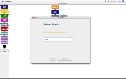
Wow. Someone went ahead and made a graphical programming language for Arduino. From the blog entry:
Finally I can release an Alpha Version of ArduinoBlocks. Only the Windows Version ist availible for download as you have to compile it for the different OSs and also for the different Mac processors. The idea is to have a visual blocks language for children that is translated into Arduino code.
I managed to get it running on my Mac by copying the .jars into a copy of my Arduino 0007 directory. Here's a program to blink an LED:
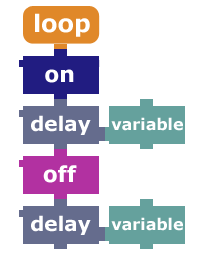
This is a lot like the programming interface for the Pico Crickets, but not quite as refined.
23 May 2006
In which I attempt to conduct a simple online payment.
The “Buy Now” link looked innocuous enough, but I was unprepared for the string of problems that ensued. First, the login failed with an inscrutable error message. Then, the available list of funding sources contains only one credit card, which I don’t want to use.
When I try to add the card I do want to use, I’m told it’s already part of my account. When I check the list of credit cards in my account (for which I must open a new browser window and manually navigate to paypal.com, since the payment page has no link to my account), I see a possible cause of my problem: this card has no stored credit verification number. This makes me a bit suspicious already, since the purported purpose of this number is as a secondary security measure to be entered at the time of payment and not stored by online servers. But this is PayPal, so maybe they have a special agreement with Visa.
I try to enter the credit card verification number (don’t forget you have to click on “Update credit card expiration” to do so, or to add a new credit card) and am told “Card number, expiration date, and address remained the same; therefore no change to the card has been made.” Apparently credit card verification numbers are too piddly to warrant a hit to the PayPal database.
Upon rereading the information in list of credit cards, I notice the button “Complete Expanded Use Enrollment”. Do I need expanded use? All I want to do is pay for something with the credit card; that seems like standard use to me. But I’m running out of options, so I click the button.
Ah, lovely, it seems that using your credit for anything at all is, indeed, expanded use (though they fail to mention anything about this on the page to edit the credit card), and requires waiting for your next monthly card statement and entering a unique number that will appear therein. This could be a problem, seeing as how I’m in Italy and my statement are sent to my parent’s house in Chicago.
Good thing that the people I need to pay will accept checks. Clearly I’m not ready for the convience of online payment.
23 April 2006


In one of his classic lectures on interaction design, Bill Verplank distinguishes handles (for continuous control) and buttons (for discrete control). He's a big fan of the former, along with motors, haptics, and all manner of musical instrument controllers. Within minutes of trying James and my force-feedback radio he had about a dozen suggestions, all excellent. Using his force stick [pdf] could be mistaken for plucking a real guitar string – until, of course, he changes it to feel like beating a drum or ringing a bell.
What's striking about Verplank's work, though, it is uniqueness. Few of the interaction design or physical computing projects I've seen (in my two years at Interaction Ivrea at least) have such a rich, physical interface, or what you could call analog interaction design. One great exception is this project: the instant lover. In a few days, with a single servo-motor (and another to ring the glass), Alejandro, Dana, Chia-Ying, and Mike created an evocative, fluid behavior. It's not interactive but it exemplifies qualities that should be more common in interaction design: non-screen, non-LED output and the use of materials to provide the texture missing in digital devices.
Blinking a LED is easy enough to be considered the «hello world» of physical computing, reading a pushbutton isn't much harder. We need to explore more complex forms of input and output.
Some other examples of analog interaction design include: String Thing by Ben Dove and Soft Interfaces by Akemi Tazaki. Any more?
26 January 2006
Working?
Originally uploaded by dam.
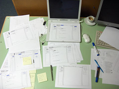
I've been developing my earlier ideas about understanding code into a design for an interface. Here are some sketches of wireframes for the software. By my next presentation (during the week of the 19th of February), I plan to evolve these sketches into a complete design.
21 June 2005
A good overview of the application visual principles to the design of user interfaces. This includes topics like hierarchy, balance, harmony, etc. An especially interesting section discusses various visual attributes (hue, value, size, orientation, shape, position, and texture) and their perceptual properties (e.g. we can instantly pick out objects of a particular color, but not shape, from a mixed collection). The diagrams feel old-fashioned, but give an appreciation for the clarity and consistency of the original Mac interface. The color plates are mostly wasted on examples of bad design or diagrams found elsewhere in the book. For better illustrations and an excellent discussion of these same principles applied to data presentation as opposed to UI design, see Edward Tufte's books, especially Envisioning Information.
For more information on Designing Visual Interfaces, see these excerpts and diagrams.
10 April 2005
Some good observations from a CHI 2000 paper (pdf) about Alice, a 3D scripting environment for novices:
"All commands in Alice animate over a period of one second.... This is not just a flashy trick but is a critically important design decision.... In a system without animation, a user can easily make the mistake of using the Move command with a distance that takes the object off the screen. An instantaneous move effectively 'teleports' the object out of sight, a mistake that is visibly indistinguishable from a delete command."
"Perhaps Alice's most distinguishing API feature is that it allows people to create behavior for three-dimensional objects without using the traditional mathematical names for the coordinate axes: X, Y and Z. Instead, Alice uses... Forward/Back, Left/Right, and Up/Down.... While it is true that some objects do not have an intrinsic forward direction, ... there are no objects that have an intrinsic X direction."
"Over 85% of users made case errors and many continued to do so even after learning that case was significant."
"Encouraging everyone on the development staff to observe real users is an excellent way of sensitizing an entire team to the needs of one's target audience."
"When faced with a new Alice command that required a numeric parameter, we saw many users try using a "1" to see what would happen.... "Magic ranges" like 0..255 and 0..32767 do not hold much appeal for novices."
"Function overloading and optional keyword parameters in a programming language can be used to support the controlled exposure of power, masking API complexity until the user is motivated to use it."
31 January 2005
This popped up while I was editing a Word document:
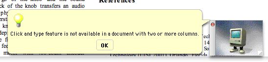
What's “click and type”? What did I do to invoke it? Why doesn't it work in multi-column documents? I have no idea. But rather than fixing it, Microsoft decided to baffle its users with this animated, Mac Classic-looking computer. They have a tendency to mask design problems with awkwardly-worded dialogs or other hacks, rather than solving the underlying problems. Apple's software has its problems, but at least someone thought about it before it was written.
03 November 2004
To add to Tog's nine:
- Hovering over a dock icon while dragging-and-dropping will not bring
an application to the front or open a folder. (So when I use exposé to show
my desktop, I have nowhere to drag the files.)
- The dock icons bounce forever when a program throws up an alert
dialog, making it nearly impossible to concentrate on anything without
first switching to the offending program. The last thing a computer needs
is more needless distractions.
Anyone know any way to fix these? I'd appreciate it.
16 October 2004
DoubleCommand lets
you remap control keys on Mac OS X. I used to it change my enter key to a
function key so I can page down with one hand on my iBook. Why Apple doesn't
include dedicated page up and page down keys is beyond me, especially on the
17" PowerBooks.
03 October 2004
Hitting Ctrl-F4 in Mac OS X will cycle through your non-minimized
windows (including hidden applications). On a laptop, you'll need to hit
fn as well. You can change the shortcut key in the keyboard shortcuts
section of the keyboard and mouse system preferences.
I've been looking for this since I got my new iBook on Wednesday. It's not as
useful as the Windows version because the switch occurs when you hit
F4, not when you release the Ctrl key. Thus, you can't
alternate between two windows; you have to cycle all the way around. But it's
something. I'm hoping that Cmd-Tab and Exposé will merge
so that I can hold Cmd and see live previews as I tab between
windows.
BTW, you can use Cmd-Tab to switch between applications and
Cmd-` (that's the backquote, on the key with the tilde to cycle through
the windows within an application.
21 September 2004
Looking at MinimalWeb
and Golden
Book, I'm inspired to find other ways to fix digital content on paper. Once
something's been printed, I read it more closely, keep it around longer, and
carry around with me. How can I take advantage of those qualities?
For example, a printing calculator-like device that records my IM conversations.
Or a physical subscription to an electronic news source (like
Wired News or Salon.com). Or a bound record of my
email correspondence with someone. Or a poster visualiazing my Internet
activity over the course of a day.
Conversely, how can a digital object acquire some of the properties of a
physical one: unity, permanence, focus? Can a program provide the same
experience as reading a book?
30 August 2004
A few suggestions from playing with Kristin's PowerBook for a few days. Many of these come from my Windows background, but I think that they're cases of Windows doing it better – not simply a desire for what I'm used to.
- Remove the distinction between active applications and open documents.
- It's confusing to have an application continue running after you've closed its last window. Especially when the only indication of this is an arrow at the bottom of a dock icon. Also, this distinction means that you can't option-tab through different windows from the same application and leads to the “invisible sheets” that Joel on Software mentions (scroll down to the Mac screenshots). Implementing this suggestion would allow access to the desktop without needing an explicitly active Finder (which would appear only if a folder window were open).
- Enlarge the traffic lights in the right of every window titlebar.
- For a company with menus designed around Fitts's law, these sure are tiny controls. It might be tough to fit bigger buttons into the slick title bars, but it needs to be done. AskTog has a more comprehensive discussion of the gumdrops (is that the official name?).
- Allow maximization of a window.
- For when we want to focus on a single document. And this means that the scroll bars should be usable by throwing the mouse cursor against the right side of the screen. And that the dock should somehow get out of the way.
- Address these nine reasons why the dock still sucks.
- Another good column from AskTog.
- Add another mouse button.
- I know that this is a long-running debate, but even Jef Raskin, designer of the Mac, says that there should have been two-buttons on the Mac mouse. As mentioned at the end of this Wired article, the context-menus should be accessible from a mouse button, not a modified click.
- Create an extended menu of programs and documents.
- A Mac hard-drive is better organized than a Windows one, but I shouldn't have to open it to launch a program that didn't fit in the dock. Something like the Windows Start menu, or something better than the Start menu (I'm referring to DragThing) would be great.
Do you have any other suggestions?
VS 2005's console toolwindow (the new default is to launch console applications inside of a VS window)
The new debugging datatips in Visual Studio 2005 (much nicer than the yellow tooltips, but not quite intuitive).
How to customize context menus in Windows (the menu items that popup when you right-click on a file or folder).
29 May 2004
From Visual Studio 2003:
Some time ago, you retrieved data from the database with the query or
view whose name is table name. The returned rows appear in
the Results pane and the database server continues to retain the result set
in its local memory, which consumes valuable server resources. Because you
have not recently used the Results pane, it will be automatically cleared in
one minute. This will empty the results pane, discard unsaved changes, and
free the resources on the database server. Then, if you want to reestablish
the result set, you can rerun the query or view.
Do you want to prolong your work with the Results pane and continue to
consume resources on the database server?
And you only get a minute to read it.
24 April 2004
I want a way to annotate web pages and other documents on my computer.
Ideally, these could be shared, to allow, for example, everyone at my job to
attach disclaimers and warnings to .NET's horrendous documentation. Does
anyone know of a plugin for Mozilla (or anything else) that allows for this sort
of thing?